Today we are taking a look at trading price ranges (by variety) on The Lupulin Exchange from our first ~5 months of operation (September 22, 2014 through February 12, 2015).
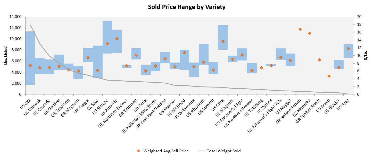
- In the graph above, the red diamonds are varietal average trade prices (CY 2013 & 2014 only - weighted by lbs sold)
- The blue bar represents the price range of all trades by variety
There are some sellers who price their listings to fetch a certain price (ie. the max price they think they can get or what they believe to be fair market value). Other sellers price hops to move - at or even below their contracted price. Forces such as broker storage fees, brewery cashflow, and the ever moving target of actual beer production/sales are at play. There will always be a range of motivations, but remember sellers always choose their price on The Exchange - it’s a free market.
The spreads in the chart above may be a function of seller motivation, changing market conditions, or (most likely) both. The bigger spread on a highly demanded variety like Simcoe indicates there are some buyers who are willing to pay a premium just to have access to the hop. A narrow range may indicate better supply/demand balance for a given variety. We’ll continue to monitor price ranges and keep you updated.
Is there a chart or metric that you would like to see? Please let us know via social media or comment below – we would love to hear from you!